Including children in ticket purchasing
For an interaction evaluation course my team and I formulated a brief based on our observations on ticket machine users. In this project, our team set out to reimagine the user experience of Helsinki’s public transport (HSL) ticket machine, with a specific focus on families with children. The driving force behind our initiative was to evaluate existing services through hands-on field research, identify potential paintpoints, and subsequently craft a design brief that would address these observations.
We assessed the user experience of HSL ticket machines. We noticed that children were keen on what parents were doing on the large screen and wanted to participate. We used this insight as a base for our design chellenge.
By the end, we developed a prototype that aimed to streamline the ticket buying process by integrating functionalities that catered to our target group’s unique needs.
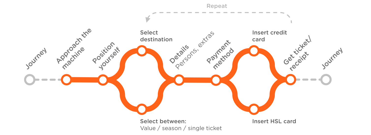
User journey of Helsinki local transport ticket machine, 2020
Sprinting but not rushing
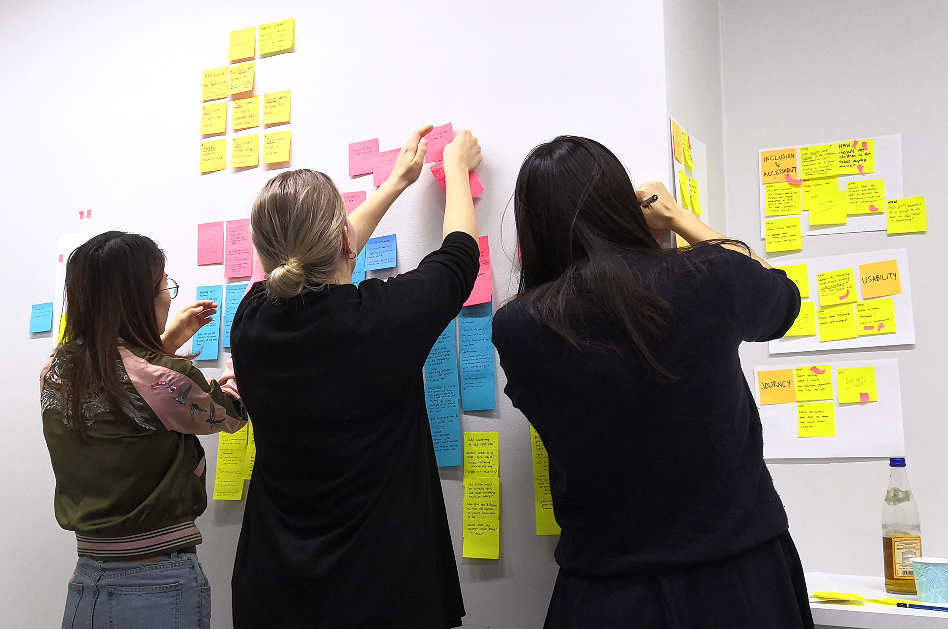
We ran a 5 day long design sprint to sketch, decide, prototype, and evaluate our concept. It was a productive week filled with fast brainstorming, sketching ideas, and making tough decisions in order to keep up with our schedule. There were no soloists in our group - we saw the value in each other’s work and merged the best elements to come up with the most suitable solution.
1. Mapping
We charted out the interaction journey, diving into aspects like recognition, accessibility, safety, usability, and the overall user experience. This visualization was foundational, framing our UX design.
We charted out the interaction journey, diving into aspects like recognition, accessibility, safety, usability, and the overall user experience. This visualization was foundational, framing our UX design.
2. Sketching
The team employed a “divide and conquer” strategy during this phase, with each member focusing on a distinct aspect of the ticket machine. We focused on opportunities that address the design of the machine, shared interaction features, GUI, and user flow.
The team employed a “divide and conquer” strategy during this phase, with each member focusing on a distinct aspect of the ticket machine. We focused on opportunities that address the design of the machine, shared interaction features, GUI, and user flow.
3. Storyboarding
After voting for our favorite ideas, translating our sketches into a comprehensive storyboard presented challenges. Some ideas that were clear on paper needed tweaking when visualized in sequence. However, this stage solidified our concept, preparing us for prototyping.
After voting for our favorite ideas, translating our sketches into a comprehensive storyboard presented challenges. Some ideas that were clear on paper needed tweaking when visualized in sequence. However, this stage solidified our concept, preparing us for prototyping.
4. Prototyping
Using Figma, our team crafted an interactive prototype. Despite the challenge of weaving together diverse features and user scenarios, we referenced the existing HSL ticket kiosk to ensure our design was both innovative, yet grounded.
Using Figma, our team crafted an interactive prototype. Despite the challenge of weaving together diverse features and user scenarios, we referenced the existing HSL ticket kiosk to ensure our design was both innovative, yet grounded.
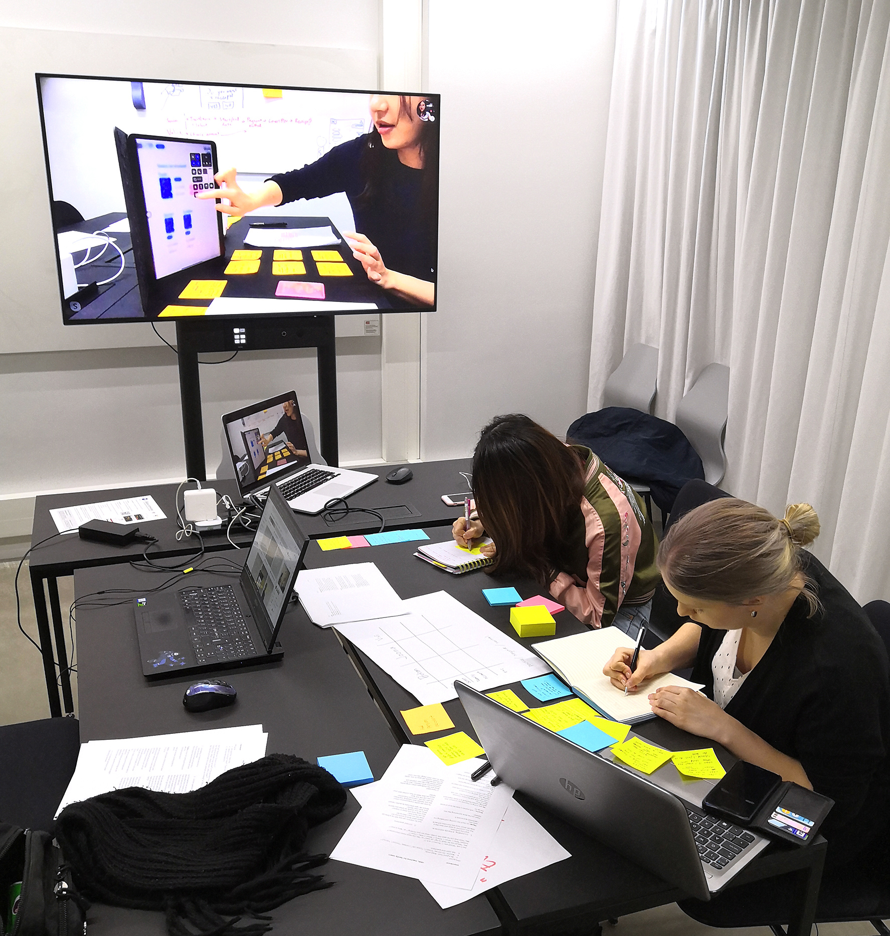
5. User evaluation
Engaging with four participants, we gauged their experiences and feedback. This user-centric evaluation was invaluable, spotlighting both the strengths and areas of improvement in our design.
Engaging with four participants, we gauged their experiences and feedback. This user-centric evaluation was invaluable, spotlighting both the strengths and areas of improvement in our design.
Solution
Our solution was to include a feature that splits the screen in half, so that the adult would control the top part, and the child the lower half. They could navigate the system independently, but only the adult could authorize any payments to avoid potential errors. Additionally, we introduced a family account plan that helps the adult to oversee the balance of the whole family at once.
By following the example of an adult, children can build the feeling of achievement and independence.
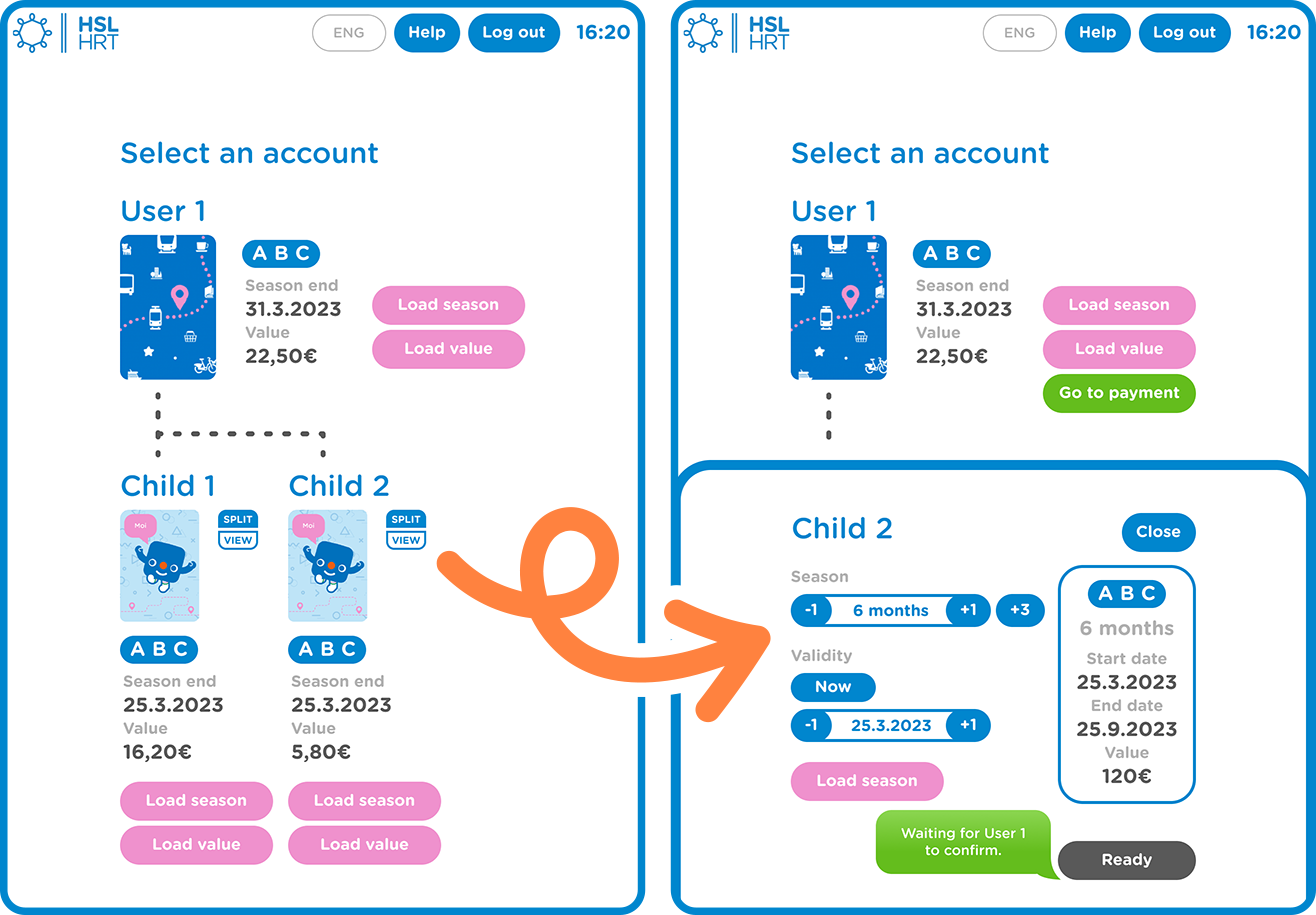
Our solution concept depicting Split View feature.
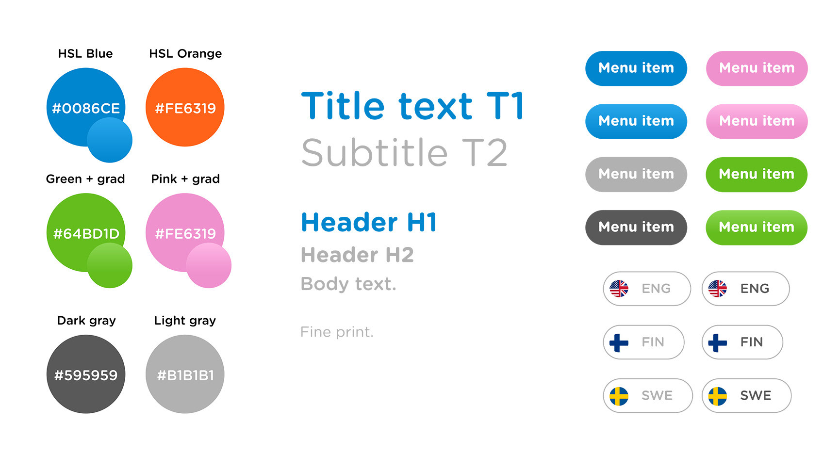
Design elements of our prototype were based on the existing HSL kiosk, while including new ways to communicate interaction.
Feedback & Analysis
The prototype received mostly positive feedback. Positive remarks highlighted the interface’s intuitiveness, clarity, and its fresh, colorful design. The family account feature was particularly well-received for its utility in managing children’s transport needs ‘on the road’.
Conclusion
While our prototype achieved some of its long-term goals - enhancing the family experience and making local transport more pleasant - there’s still room for improvement. The feedback has provided a roadmap for refining our design, ensuring that the final product resonates with our target demographic.